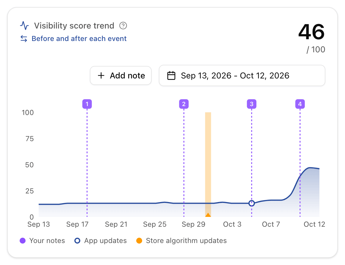
Your visibility jumped last week. Was it the new subtitle, the Reddit post, or the store itself? Until now the chart showed the move and left the why to your memory.
Every chart in Applyra now carries what happened:
- Your notes. Click a day, write what you did: a launch, a campaign, a price change. It shows as a numbered flag, on every market of the app or on just one.
- Your app updates, logged automatically every time your listing changes.
- Store algorithm updates, an orange band on the days the App Store or Google Play reshuffled your market.
Then Before and after each event puts a number on each one: your average visibility over the 7, 14 or 30 days before, against the same days after. Anything else that happened in those days is listed with it, so a climb with two possible causes shows you both.
The same view works for a single keyword. Click the 7 day trend of any row in the Keywords Tracker to open its rank history, with every event on the line and its rank before and after each one.
Notes are on every plan. The 14 and 30 day windows and a full year of events come with Unlimited.