What the app page shows, tab by tab
The app page carries two scores, a visibility trend and five tabs: tracked keywords, ASO Health, category ranking, competitors and the store listing.
Video transcript
The app page is one app in one market. It tells you whether you're being found there, and whether your listing is built to win. The header carries the listing facts: the country, the language, the store rating, and how many ratings are behind it. Its link opens the real store page. On the right, two scores, the same size on purpose. Visibility is the result. ASO Health is the cause. Read them together. A strong listing with weak visibility is a targeting problem. The reverse is usually a brand carrying the score. Below, the visibility trend, with a dot on each day the listing changed. Hover one, and it names the version and the fields that moved. Next to it, the ASO Health widget. And under both, Keywords to track: terms from your own listing you don't follow yet. Then five tabs. Tracked keywords: this app's rows of the tracker. ASO Health: the full audit, and the fields to fix first. Category ranking: the store's own chart for your category, in this market. Competitors: the apps you added, and the ones Applyra found around you. Store listing: the listing as the store serves it today. Open it before you write a new version. And on the paid plan, a market bar sits above it all, to switch between countries.
The app page is one app in one market, and it is where you find out whether you are being found there and whether the listing is built to win. It opens on a header carrying the listing facts, two scores, a visibility trend and the keywords worth adding next, then five tabs: Tracked keywords, ASO Health, Category ranking, Competitors and Store listing.
The header: the listing facts and the two scores
Icon, title, and below it the iOS subtitle when there is one, otherwise the developer name. Four badges follow: the country, the language code, the store rating out of 5, and the number of ratings behind it. A link opens the real store page, which is the fastest way to check that Applyra and the store agree. When the two disagree, Applyra shows a different number from the store covers the three usual causes.
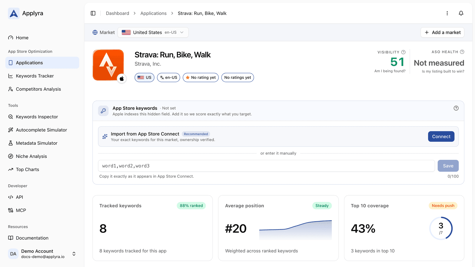
On the right sit the two scores, the same size on purpose.
| Score | The question it answers |
|---|---|
| Visibility | Am I being found? |
| ASO Health | Is my listing built to win? |
One is the result, the other is the cause. Reading them together is the point: a strong listing with weak visibility is a targeting problem, the reverse is usually a brand carrying the score.
The visibility chart and the ASO Health widget
The visibility panel plots the score over time, with a dot on every day the listing changed. Those dots come from release history, and hovering one names the version and the fields that moved. The free plan draws seven days, the paid plan draws all of it, which is what lets you put a release marker next to the weeks that followed it rather than only the day after.
Next to it, the ASO Health widget summarises the audit and links into the full tab.
Under both, Keywords to track lists search terms pulled from your own listing that you are not following yet, with their traffic, difficulty and KEI so you can tell which ones pay off fastest. It can be dismissed.
On an iOS app with no keywords field recorded, a card at the top asks for it. That field is covered in connecting App Store Connect.
The five tabs
Tracked keywords is the tracker filtered to this app: position, movement, and the metrics behind each term. Adding one from here is the same flow as the keywords tracker.
ASO Health opens the full audit: the axes, what each one penalised, and the fields to fix first. What each axis measures, the score bands and the ceiling a rewrite can reach are explained in the ASO Health score and its three axes, and every table, badge and finding in the tab is read in reading the result.
Category ranking shows the store's own chart for the app's category in this market, ranked position by position, with your app flagged. It answers whether you are visible in the category at all, which is a different question from keyword visibility. The same data, across categories and countries, is in top charts.
Competitors lists the apps you compete with in this market. Some you added yourself, others Applyra found by looking at who ranks around you on your keywords. See competitors.
Store listing is the listing as the store currently serves it: the App Store keywords field on iOS, the screenshots, the description, the release notes, then last updated, version, pricing, language, market and developer. This is the tab to open before writing a new version, alongside the metadata simulator.
Switching markets, and deleting an app
On the paid plan a market bar sits above everything, switching between the countries you track for this app and an All markets view. That view is described in tracking one app across several markets.
The menu at the top right holds Delete application.
Frequently asked questions
What are the two scores at the top of an app page?
Visibility answers am I being found, and ASO Health answers is my listing built to win. Visibility is the result measured from live store positions, ASO Health grades the listing that produces it, and they are shown side by side because a gap between them is the thing worth acting on.
Why does my app page show Not measured instead of a score?
A score reads Not measured when that market carries no score yet. Applyra scores an app as part of adding it, then again with every daily measurement, so a blank is never the same claim as a zero.
What are the dots on the visibility chart?
Each dot marks a day on which the store listing changed. Hovering one shows the version and which fields moved, so you can line up a drop or a climb with the release that caused it.
Last updated on